
5 Paint Color Mistakes That Are Making Your Rooms Feel Smaller

The Content: Paint is the single most transformational, cost-effective design tool available. However, picking the wrong shade or finish can immediately drain energy from a space, making open-concept areas feel disjointed and small rooms feel cramped.
1. Ignoring Room Orientation and Light Undertones Slapping a stark, crisp white paint on the walls of a dim or north-facing room won't magically make it look bright—it usually makes it look cold and clinical. North-facing light carries blue undertones, requiring warm neutrals (soft taupes, creamy off-whites) to bounce cozy, flattering light into the space.
2. Chopping Up the Room with Contrasting Trim Painting baseboards and door casings in a stark, contrasting color draws horizontal lines right through your room, visually cutting your ceiling height in half.
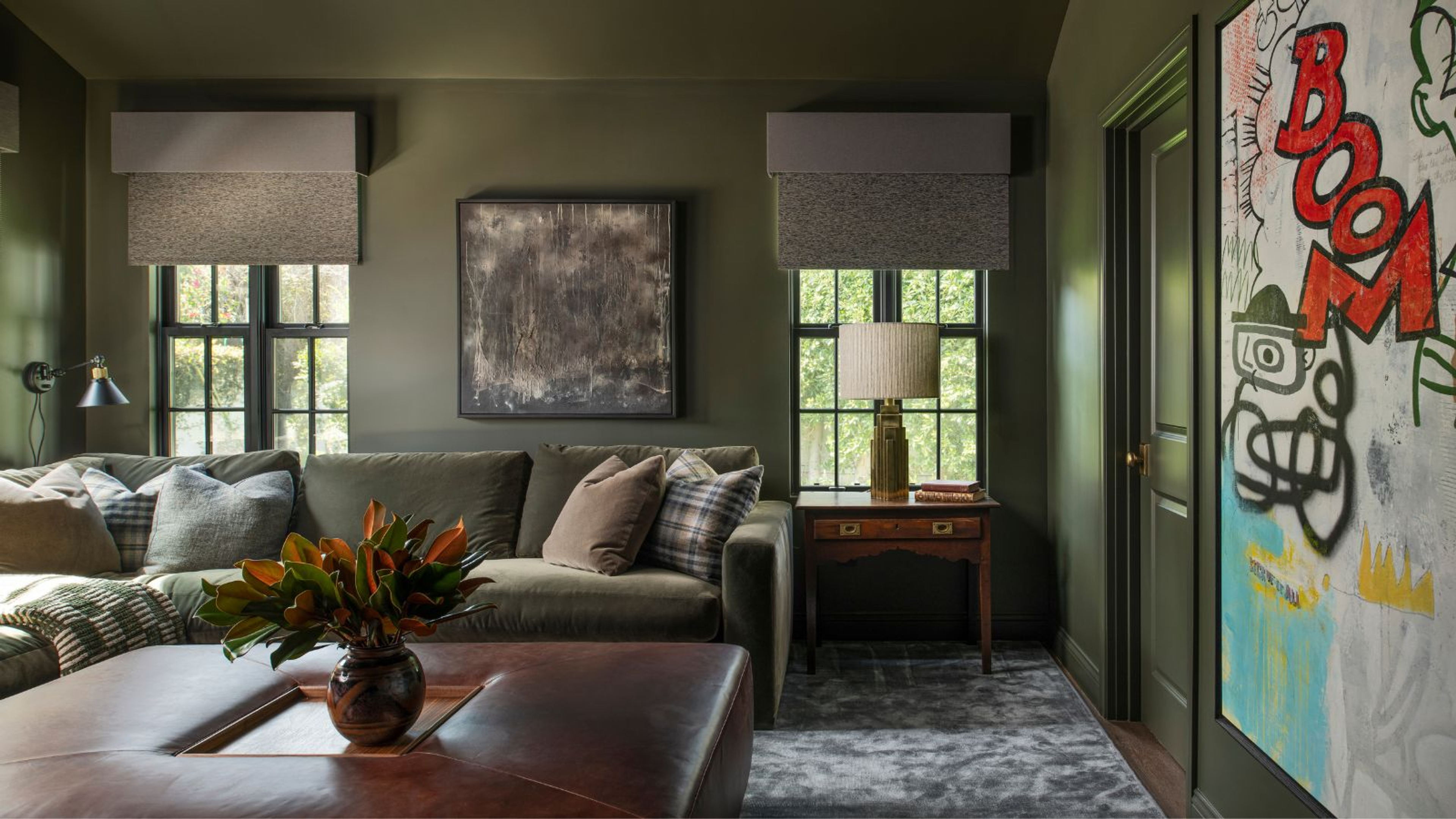
3. Skipping the "Color-Drenching" Technique If you want a small room—like a powder room, den, or compact bedroom—to feel larger, paint the walls, trim, baseboards, and even the doors in the exact same hue. Eliminating high-contrast visual breaks fools the eye into perceiving seamless, endless depth.
4. Forgetting the "Fifth Wall" Leaving ceilings a stark flat ceiling-white while painting walls a rich, mid-tone color creates a hard visual cap. Either keep ceilings softly tinted or wrap wall color onto the ceiling to pull the eye continuously upward.
5. Choosing High-Gloss Finishes on Uneven Walls Glossy finishes bounce light erratically, drawing attention to every imperfection in dry-wall and narrowing visual boundaries. Stick to flat, matte, or subtle eggshell finishes on broad wall surfaces.

Have a project in mind?
Tell us about it.
We work out what you actually need before anything is drawn — how the space gets used, what it should cost, and what is worth keeping.